Welcome back to my GoKiddo build in public journey. If you missed Part 7 , you can check it out here.
Here’s a quick update about where I am at with GoKiddo.
New Marketing Landing Page
Firstly, why do I need a marketing site if I already built the app? The reason is SEO (search engine optimisation). In lamens terms, this means how people will discover you on the internet.
Mobile Apps and Web Apps are not designed to be good for SEO.
- The mobile apps are separate from the internet, and Google search does not have access to the individual pages etc., which makes it hard for people to discover.
- Web Apps are notoriously bad at SEO because they are a little bit different than traditional websites. The GoKiddo Web App, for example, is actually a single page with a lot going on behind the scenes, and the view you see in your browser changes depending on how you interact with it. Which is exactly why it’s bad for SEO. There is not enough structure for Google to index and map it to search results.
Which is exactly why I decided to build a separate marketing website. In a sense, this will create a funnel on the web, where you can lure potential users in, and then direct them to the respective apps. Almost like flowers luring bees.
Now onto the technical stuff. In the past, I have opted to use tools that do a lot of the groundwork for you and make it user-friendly. But there will always be a trade-off.
The price you pay for “user-friendliness” is losing the freedom to do exactly what you want. Previously I built a quick landing page for GoKiddo using Framer, and it’s great, but I quickly realised that it does have some limitations.
I have been itching to code a website for a while now, and I saw this as the ideal opportunity. I decided to build GoKiddo’s website using Astro and Tailwind CSS.
I don’t want to bore you, but basically, Astro is on a mission to:
- Make it easier to build a fast website than a slow one.
- Make it easier to build with code than without it.
- Make it easy to build a great website, period.
If you are interested in websites and how they work and if you would like to build your own website, I encourage you to check out Astro and Tailwind CSS. It’s really fun building a website and a skill everyone should have.
I built GoKiddo’s new landing page in a single day, and I am hosting it using Netlify. The best thing, it costs me NOTHING each month, because Astro allows me to build a lightweight website which allows me to take advantage of Netlify’s very generous free plan,
You can check out the new website here.
I analysed the website using a tool from Google called Page Insights and the results were astonishing: 

Now, you might ask, don’t all websites do this well? And the answer is definitely NO. Feel free to analyse some of the websites you use often using Page Insights.
What’s next?
I have finally reached a point where I am happy with all of the features of the app and I am ready to list it on the app store.
During my prep to list on the app stores, I realised a few things:
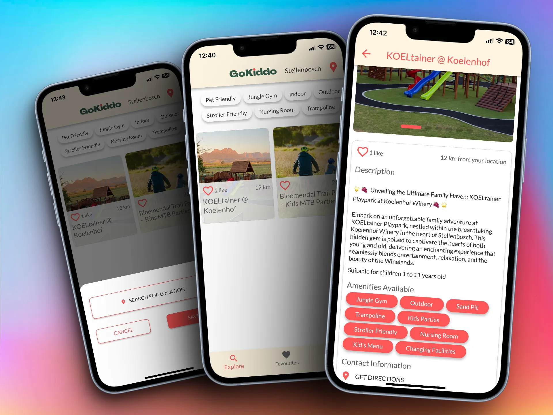
I need some high-quality screenshots of the app, but for that, I need to actually list a few companies manually, so that the app is populated with real listings to illustrate filtering etc. I plan on using Shots.so to create the renders of the app on a device screen and I will also use these renders on the website. 
If you want to process payments on an iOS app, you need to pay a 30% commission to Apple.🤨 And the worst thing is, you are not allowed to redirect the user to another platform to complete the payment using a link or even tell them using words to do so, or your app will be rejected.
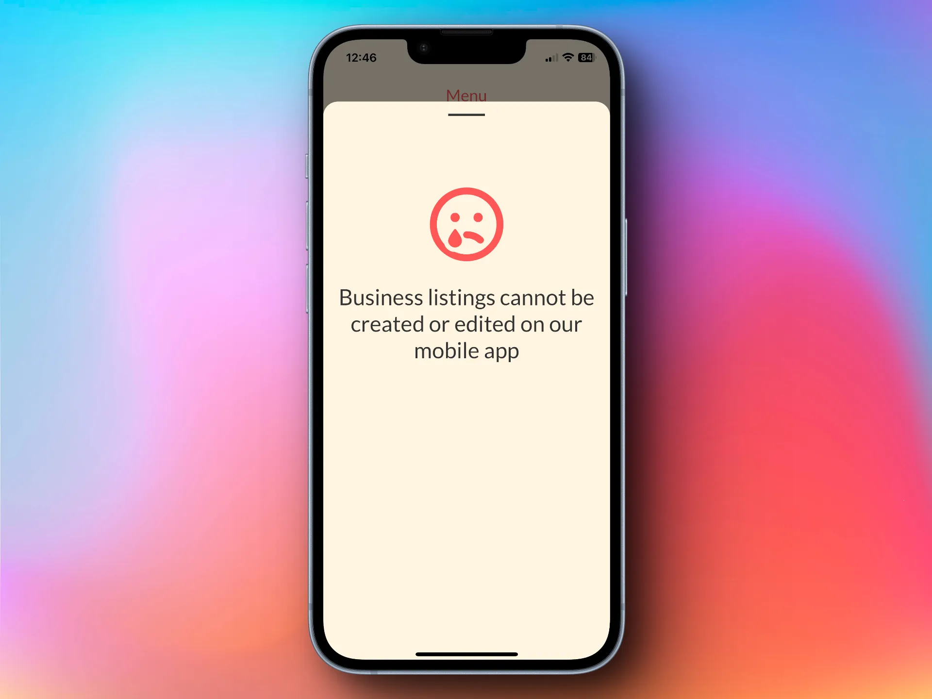
Even big companies, such as Netflix face this issue, which is why you are not able to sign up for Netflix on their app, only on their website and then you can sign in on the app and use it as a “reader” of the website. This will create a bit of friction for businesses who want to list, but I believe it won’t be too much of a problem. If a user tries to list a business on the app, they will see this screen and hopefully click that they need to go to the website and list there. 
As you can see, I am not mentioning the website, or giving them a link to click on, I am simply letting them know that what they want to do is not possible on the mobile app. Not ideal, but better than paying 30% commission.
Till next time, I hope you learnt something and thanks for reading and being on this build-in public journey with me.

![Cover for Build in Public: GoKiddo [Part 8]](/_astro/screenshot-2023-08-26-at-12-12-11-c220cfd653.Bxqcmq-q_ZleP2w.webp)
